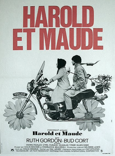


some movie posters just nail it...and these ones certainly do. i think there is something that just really works about red, yellow, and orange hues with basic black and white... it's a no-nonsense, straight-forward look that kind of flashes right at you. i like that. i think all of these posters would look great together, in different frames, hanging on the same wall...or at least in the same room.

No comments:
Post a Comment